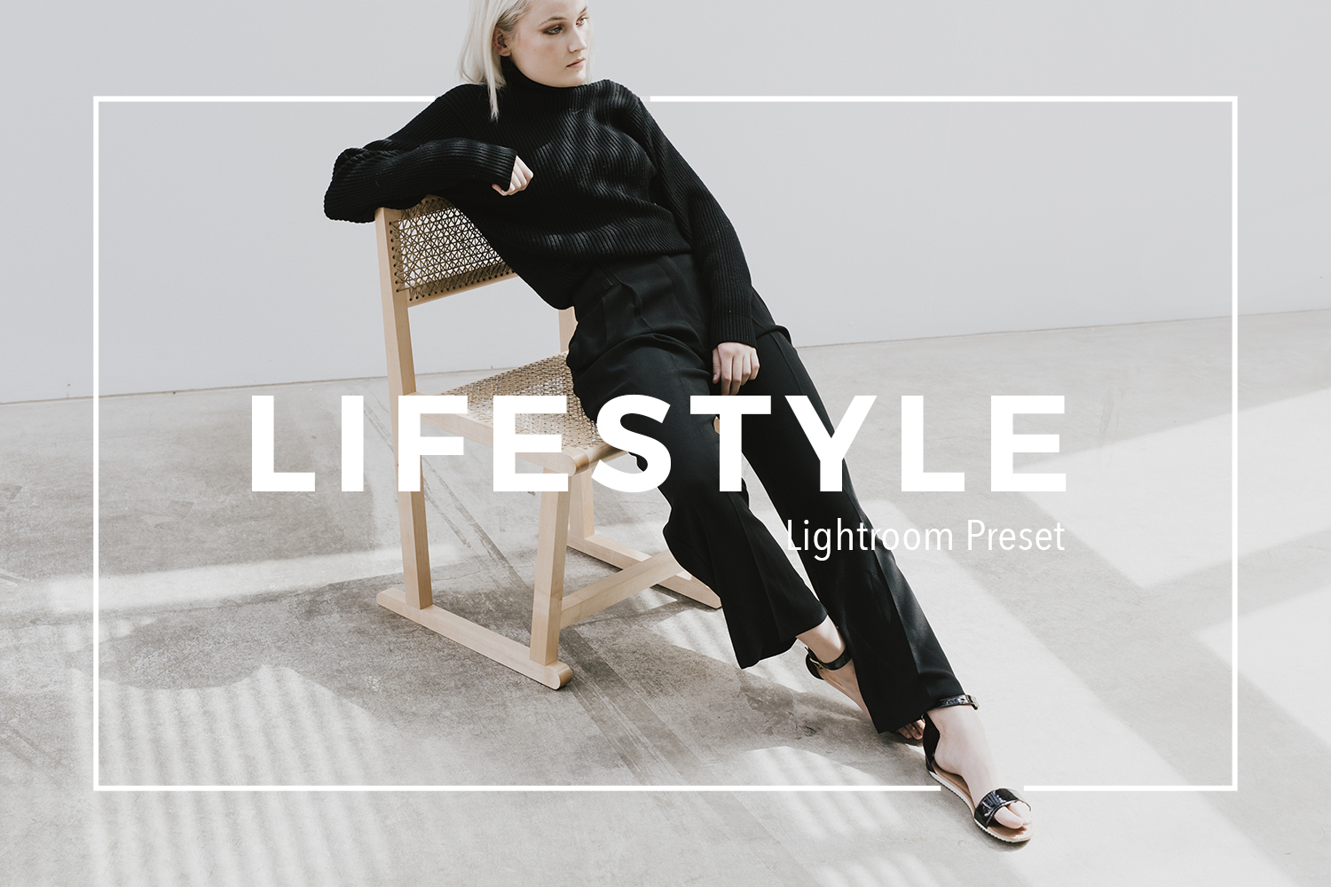
Using Lightroom Preset Part 2: Customizing Contrast, Fading, and skin tones
Why customize?
Personal style. You might like to be able to control how much highlight or shadow fading there is in your images, amongst other things.
Consistency in varying shooting situations. Being able to tweak settings can help you achieve a similar look across both high contrast and low contrast scenes.
Skin tones. Sometimes skin tones can look a bit funky in certain lighting with certain presets. Tweak the settings to flatter skin.
In this post I go through how to customize your presets to suit a variety of situations. I will be mostly using my own presets (you can find them at my preset store on Etsy), but I also include an example of customizing a Dawn Charles preset. All images are mine.

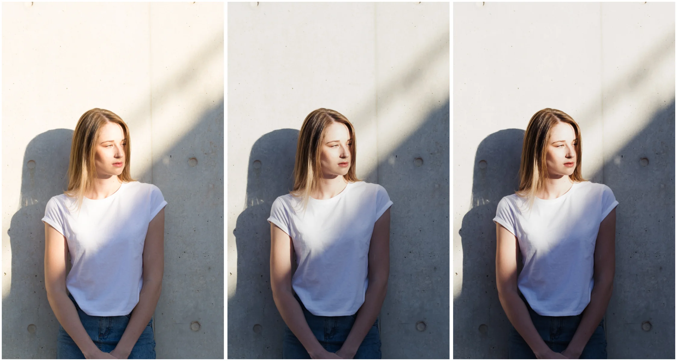
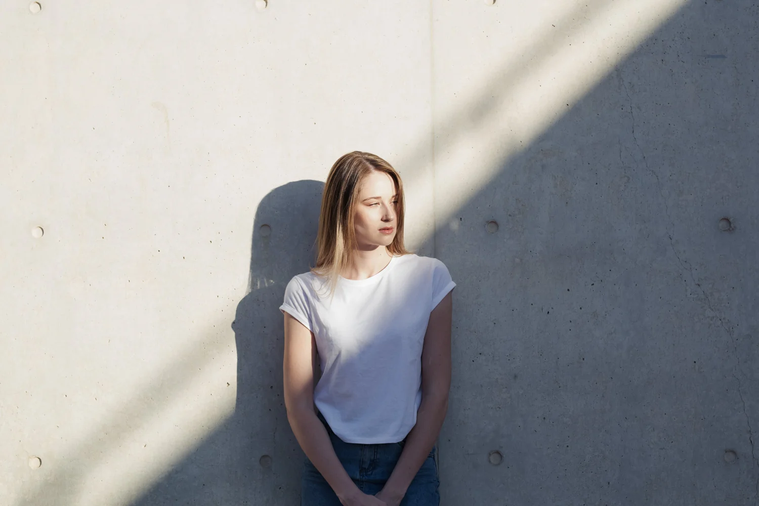
One click and it's done! Easy when shooting in natural light in open shade. RAW (left) and HB2 preset (right)
CONTRAST
Sometimes, when the exposure and colour balance of a photograph is already exactly as you want it, and the scene is neither too contrasty or very flat- the preset works with one click, like magic.
Other times you might be shooting subjects in situations that don't fit that- for example you are shooting in bright afternoon sun with deep harsh shadows, a low contrast backlit portrait, or flat light on an overcast day. Editing those images may need a few extra tweaks, with or without a preset.
High contrast situations
In high dynamic range images, particular those involving portraits in direct light, the contrast on skin can be harsh. This could be exactly what you are aiming for, in which case you might not need to touch the Lightroom edits much after applying the preset.
If you want the image to have more gentle transitions from light to shadow, and preserve more of the shadow and highlight detail, there are a couple of ways you can do with by customizing the presets (my VSCO inspired A6 preset used for examples below)
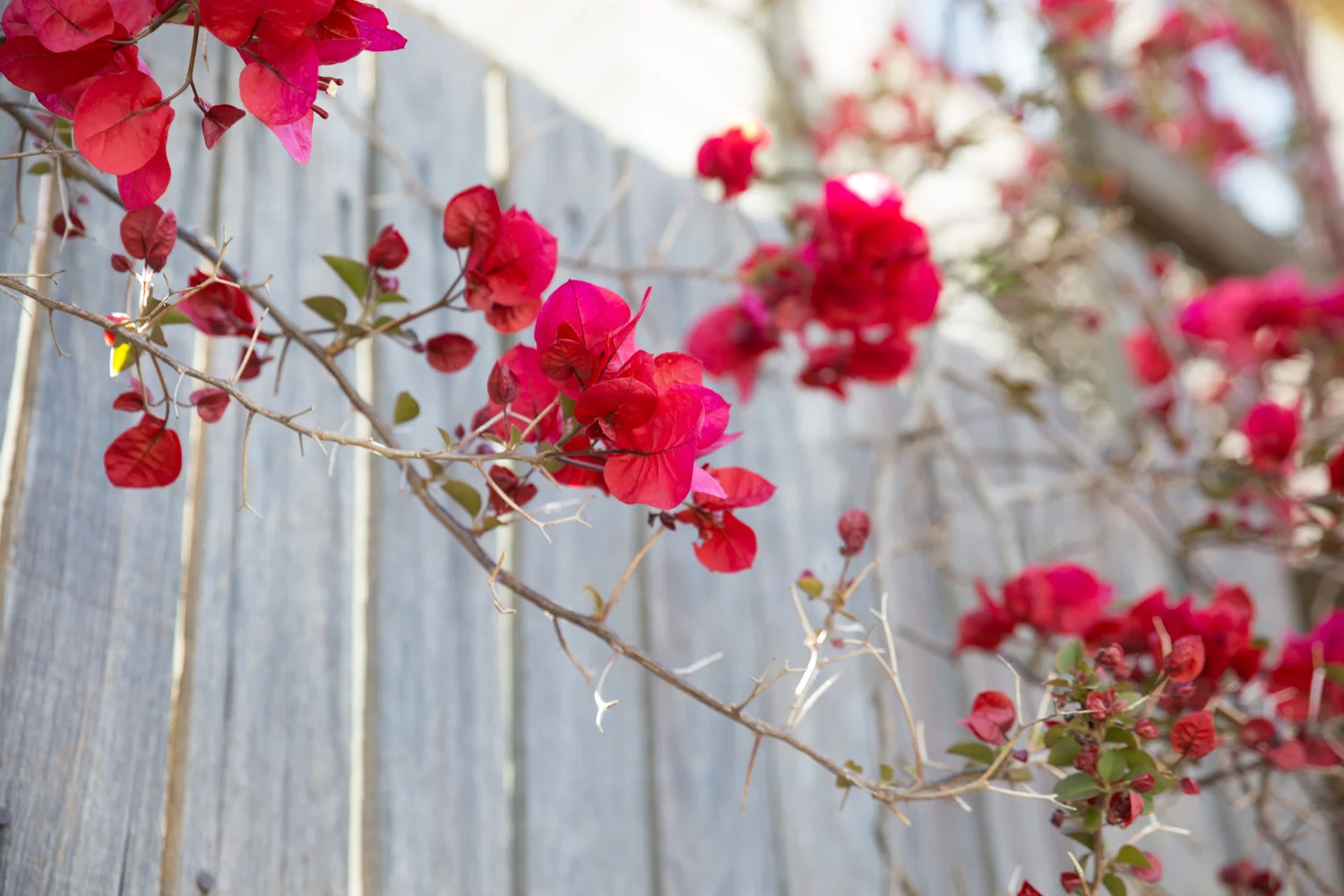
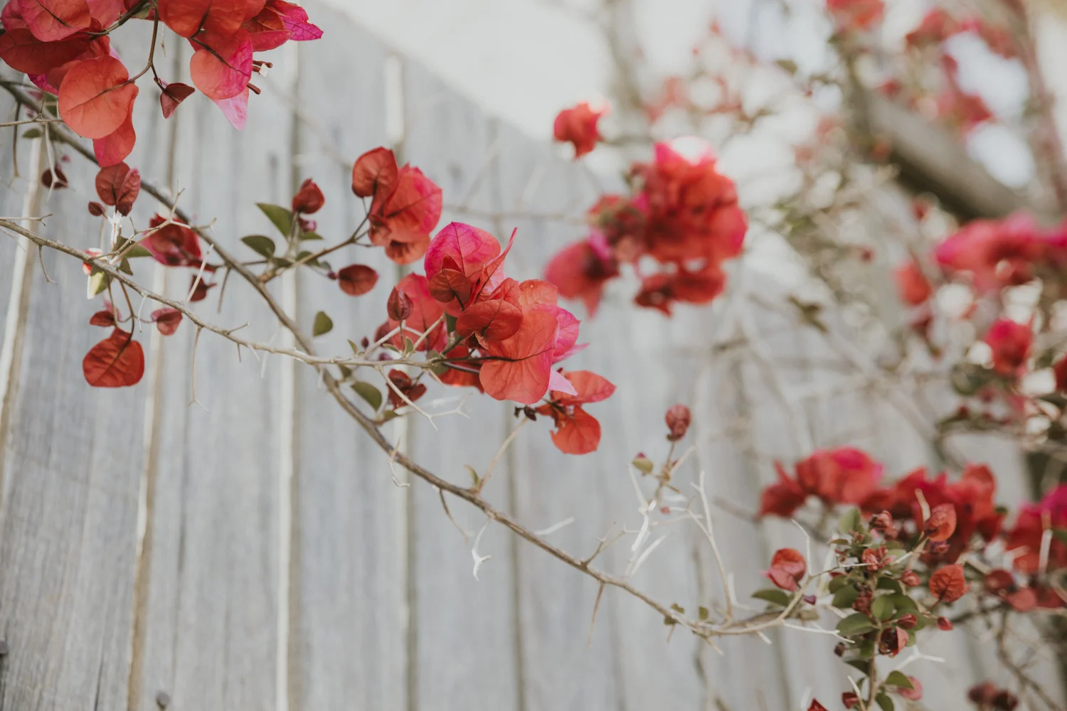
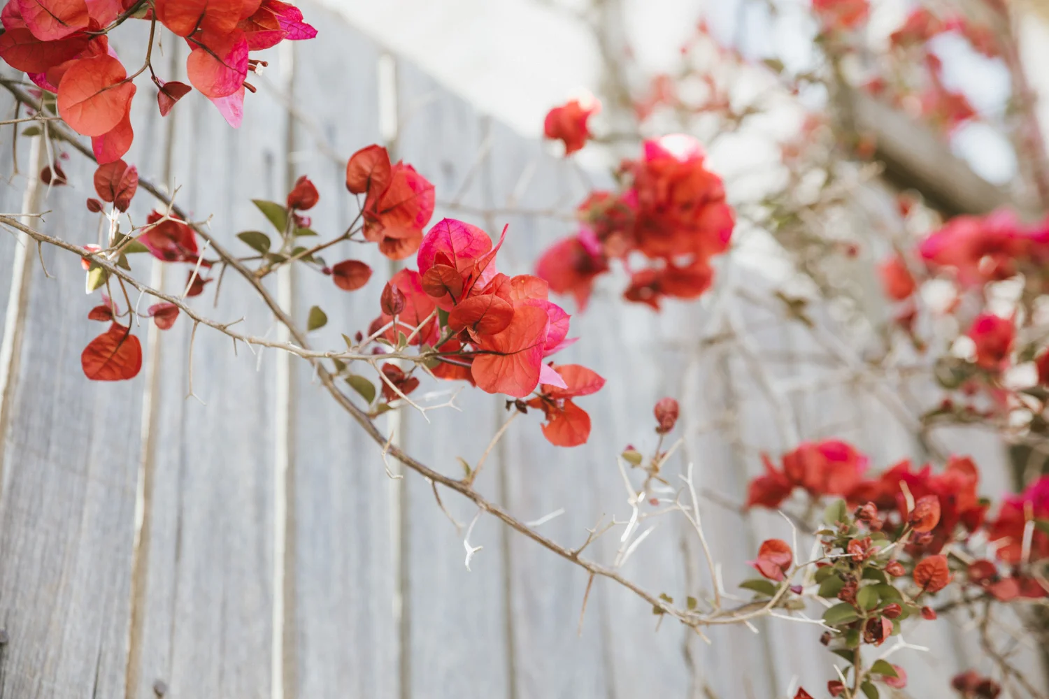
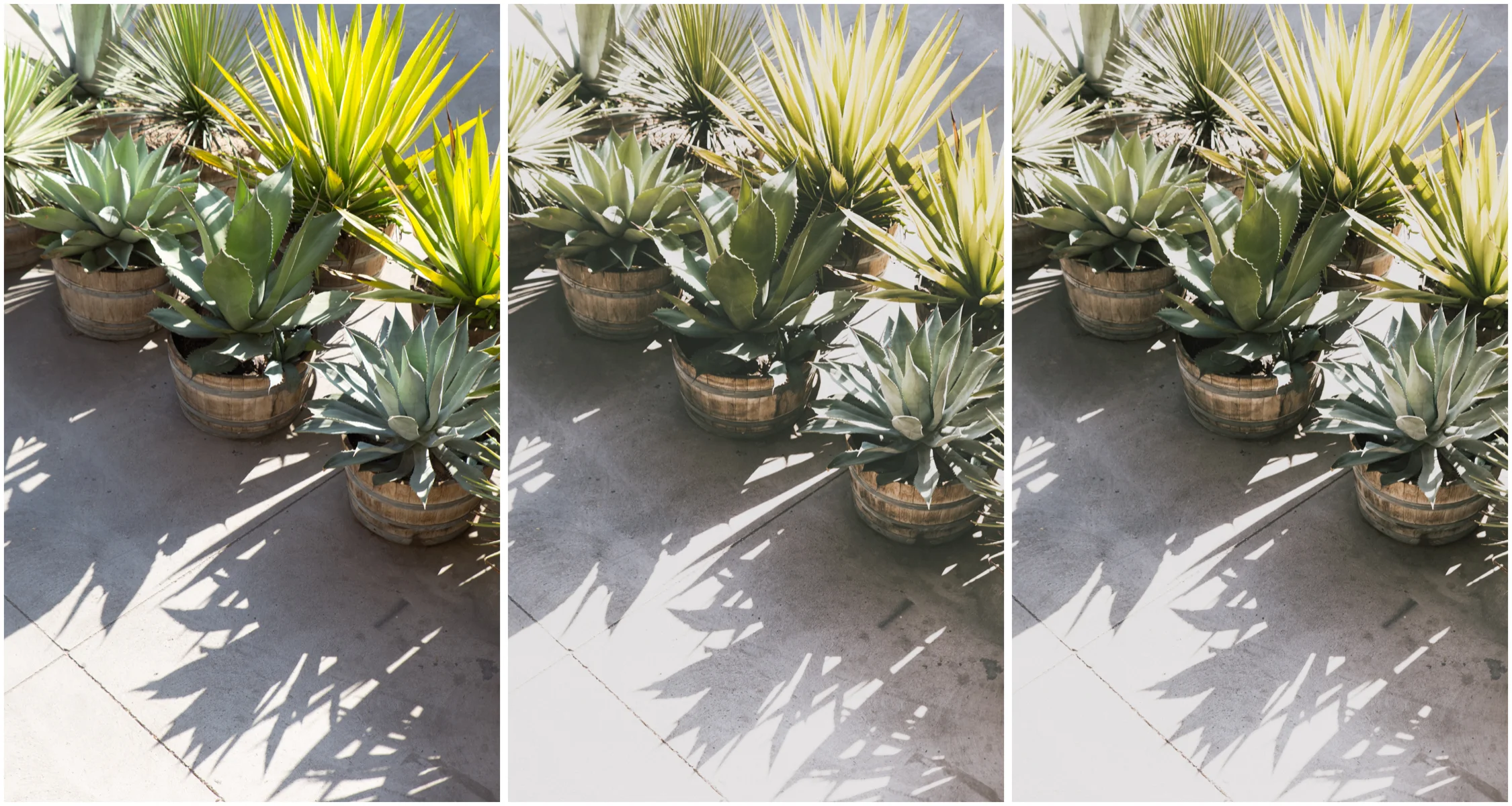
RAW (left), A6- (middle), A6 (right)
You could try:
1. Using the A6- (reduced intensity version of the preset). This is the quickest easiest way to achieve that, but it does mean that the colour shifts and other stylistic features of A6 are also reduced.
2. Customizing by tweaking the contrast, clarity, and tone curve. This allows you to reduce the contrast even further than the minus version.
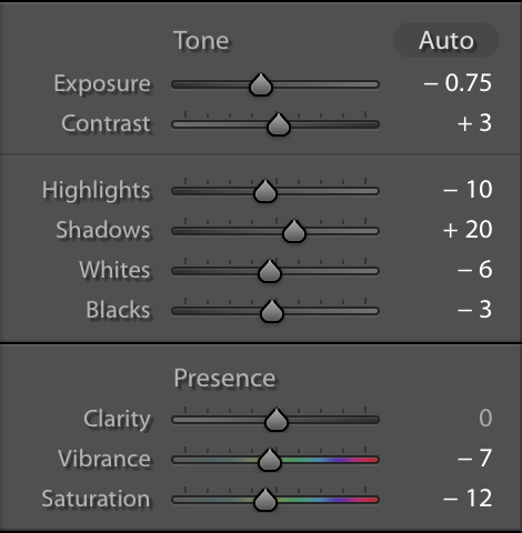
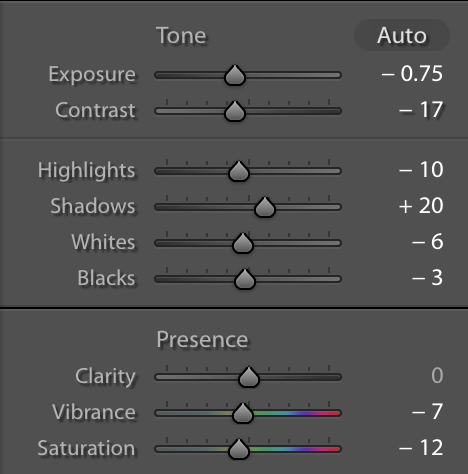
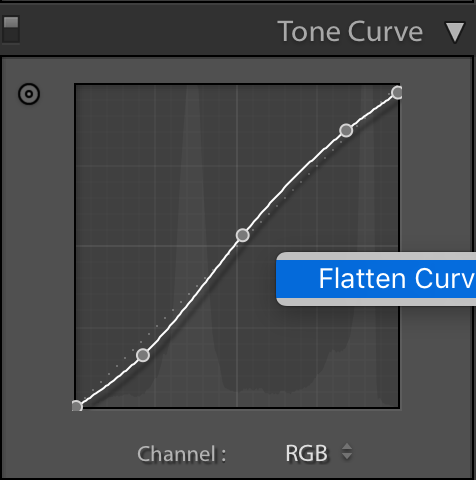
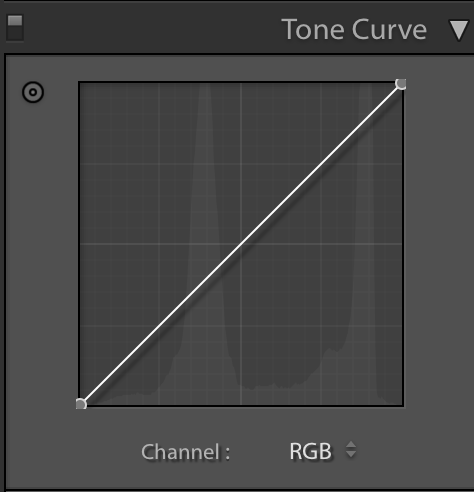
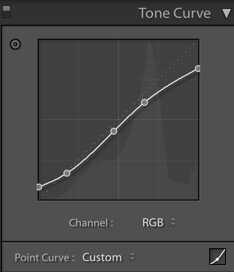
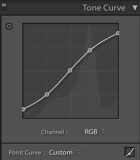
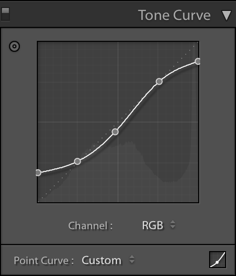
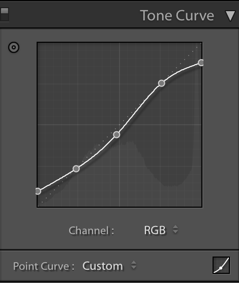
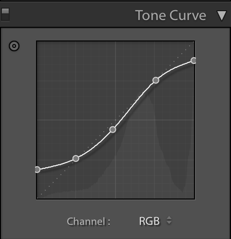
In the image below, I started with the A6- preset, then reducing the contrast (in the 'basic' panel) from +3 to -17, and flattening the tone curve. Screenshots of the editing changes shown.
If you want to reduce the harshness of the light and shadows even further than the reduced version of A6 (A6-), you can tweak contrast, tone curve, and clarity
Low contrast situations
On the other side of the spectrum, it is common to get quite a low contrast image when shooting backlit (and I do looove shooting backlit). If the rest of your images in the series are much more contrasty it often makes sense to keep things reasonably consistent.
To increase the contrast and definition of the backlit image above, I started with the A6 preset and then increased contrast to +61, increased clarity by +14, and decreased the saturation of the red and the orange channels in the HSL panel. I do this because I prefer skin tones to be slightly desaturated, and when increasing contrast globally, it tends to make colours more saturated overall.

RAW (left), A6 Lightroom preset (middle), A6 with contrast, colour, and clarity tweaks
HIGHLIGHT FADING
In some presets, such as my VSCO inspired M5 preset, my Life//style preset, and a number of others, there is a 'matte' effect with highlight fading and intentional crushing of some highlight details. I like the slightly vintage filmic feel this gives to some images. It's useful to be able to tweak the amount of highlight fading to suit your personal taste and aesthetic of the images. The amount of fading built into a particular preset might be a bit too stylised for your image set.
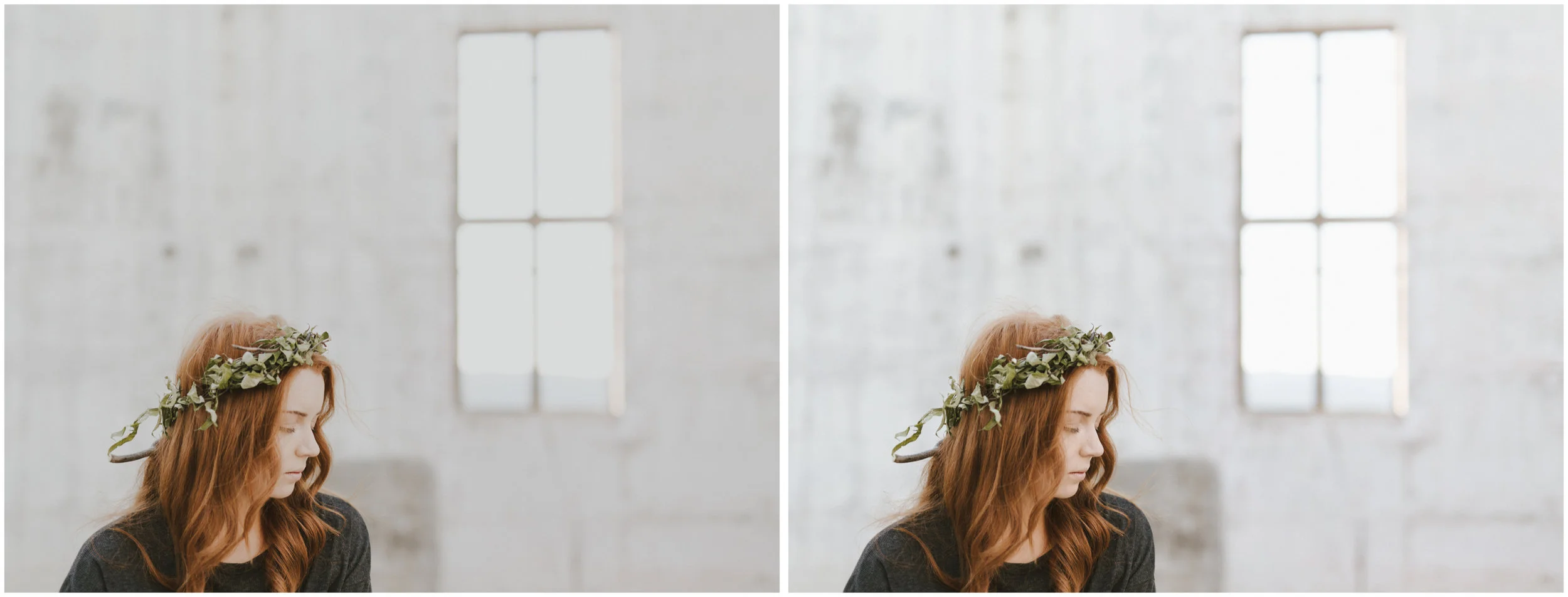
RAW image
Life//style preset applied with no additional edits
You could try:
1. Using the (-) version of the preset.
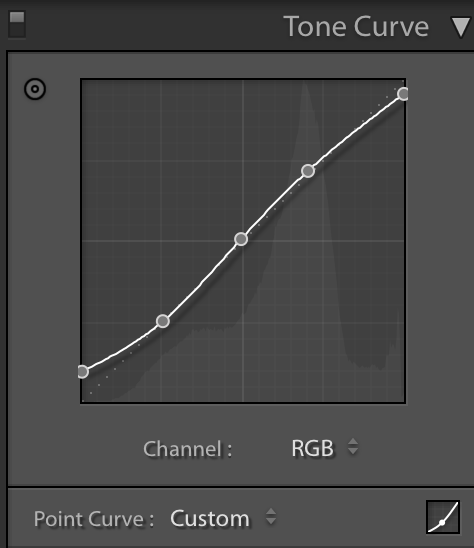
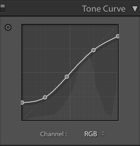
2. If you want to keep the other stylistic elements of the full strength preset rather than going to a (-) version, you could simply customise your preset. Customizing highlight fade is super easy! All you need to change is the position of the highlight point on the tone curve (the top right part of the curve, screenshots below). The lower you take that point, the more fading, and the higher you move the point, the less fade.
LIfe//style preset applied, with tone curve adjusted in highlights to reduce fading.
M5 preset (left), M5 preset with reduced highlight fading (right)
SHADOW FADING
To customise shadow fading, you do the same thing to the tone curve, except to the bottom leftmost part of the curve- examples below using Modern//Mellow preset.
Modern Mellow Preset
Modern Mellow preset with shadow fading reduced.
SKIN TONES
Some presets are easier on skin tones than others. In closeup portraits, the edgier presets with more dramatic colour shifts (e.g F2, Modern//Mellow) are usually more problematic on skin than the 'dreamy' (M5) and minimalist (Life//style) type presets. You could try one or both of these two things:
1) Use the reduced (-) versions, which are designed to have less dramatic stylistic and colour changes.
2) Tweak the preset. The specific changes will depend on a number of things including- the image, your style, the type of portrait, and the preset used. In general what I do with most situations to make skin look more flattering while keeping the stylistic qualities of the preset (outside of retouching) is- reduce contrast in the basic panel, reduce clarity, increase the luminosity of the red and orange channels in the HSL panel, and sometimes reducing the saturation of red in the HSL panel.
Examples below.....
VSCO F2 inspired preset is fantastic for vivid scenes- street and travel photography, colourful still life. It works well for environmental portraits (where the subject is relatively small in the frame), but for close ups it can be unflattering (not always, but a lot of the time especially for females).
F2 preset applied. F2 can be unforgiving on skin tones, and in this image I feel that the skin is a little too red and contrasty
F2- preset, which is an easy one click way of getting the F2 look for more flattering portraits. But because it has reduced F2 stylistic effect applied, there is less shadow fade, colour shifting, and matte effect than the F2 preset.
If you want to selectively tweak the skin tones but leave most of the F2 stylistic effects in place, you can follow the steps for tweaking skin above after applying F2.
To 'fix' skin with F2 Lightroom preset applied:
Reduce contrast ( from 30 to roughly 15)
Reduce clarity (by approx -7)
Increase the luminosity of the red and orange channels (roughly + 10 for each, depending on the image)
Like F2, the reduced (-) version of Modern // Mellow preset is better for portraits. Alternatively, you can tweak the preset to flatter skintone. That way the other stylistic elements are not effected as much as using the minus (-) version.
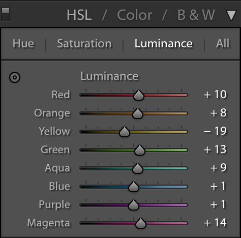
For the image below, I changed the following settings. Contrast- reduced by 10, increased luminance of yellow by 10 and red by 4, slight adjustment in tone curve
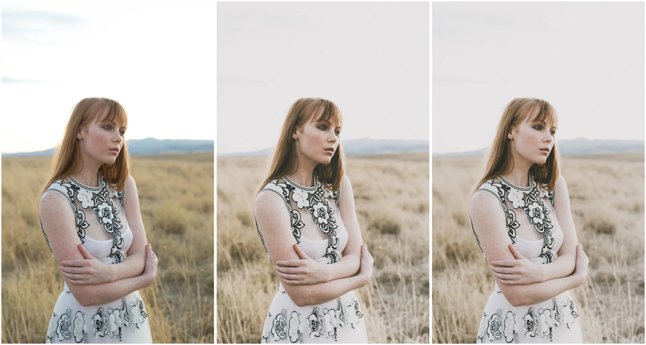
RAW (left), using Modern//Mellow preset (middle), skin tone tweaks applied (right)
Modern//Mellow Preset with tweaks to improve skin tones
OR ... USE ANOTHER PRESET
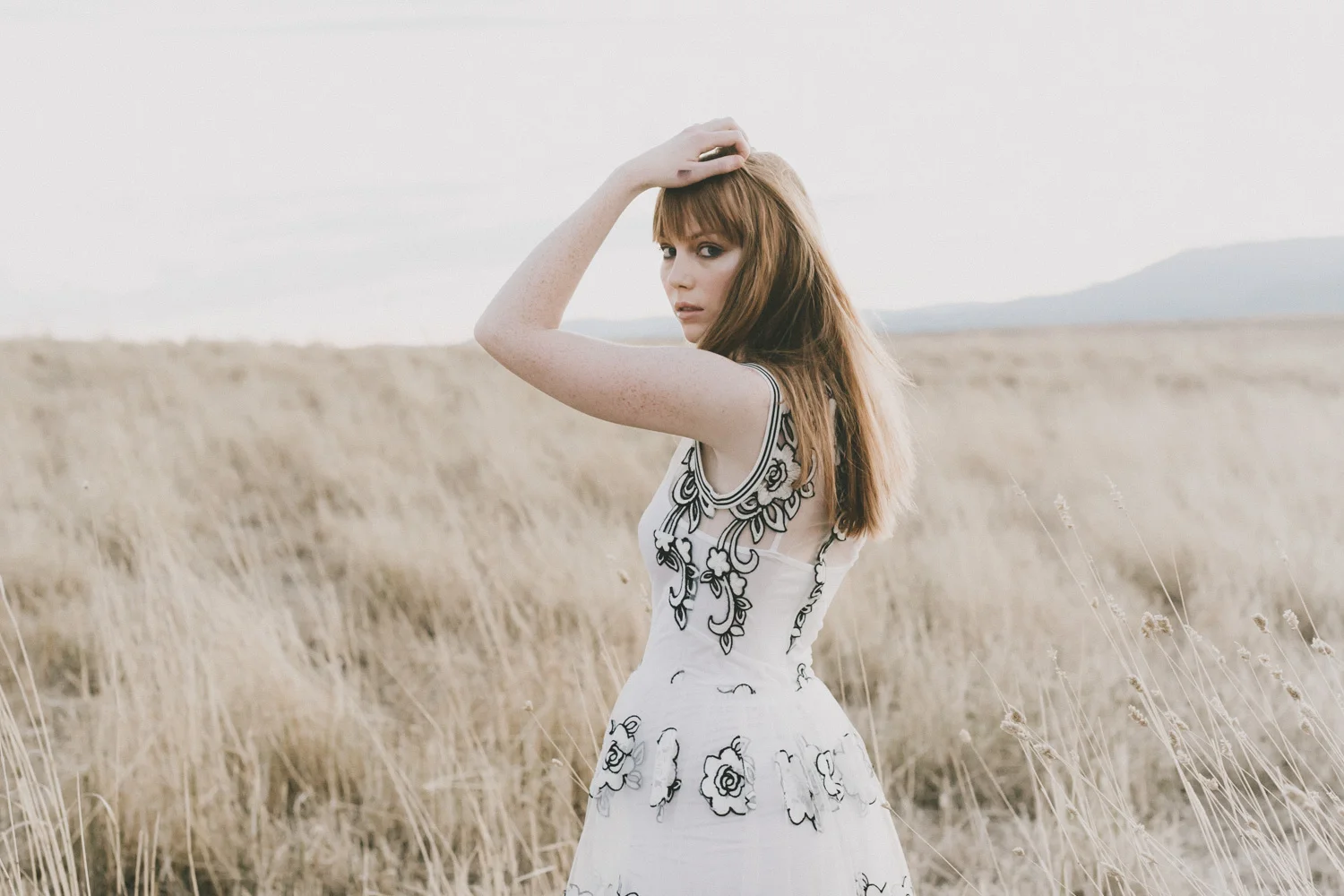
Another option is to start with a preset that might be more flattering to skin, as long as it suits tones of the image. I used my Life//style preset for this particular editorial as it suited the aesthetic of the shoot as well as being great on skin tones (saves time in retouching- win).
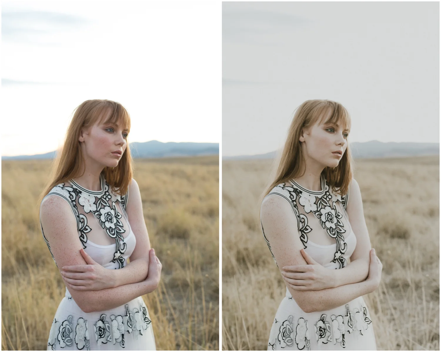
Colour and exposure balanced RAW image (left), edited with Life//style Lightroom Preset with no further adjustments (right)
CUSTOMISING OTHER PRESETS- DAWN CHARLES
I recently purchased the Dawn Charles preset pack and I LOVE what it does to greens and reds- such a dramatic cinematic look, really suits her gorgeous work.
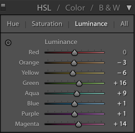
When using it to edit my own images, I have been finding myself tweaking the settings, especially for closer up portraits. The preset is quite high contrast and also gives areas of skin in shadow a distinct red tinge. To keep my images consistent to my style, I like reducing the redness in the skin and reducing the contrast/clarity in the skin.
The tweaks depends on the image, but generally what I do is drop the contrast from 20 to roughly 6, drop clarity by about 10, reduce the saturation of the red channel (in the HSL saturation panel), increase the luminance of red by roughly +10, and of the yellow channel by roughly + 2. For some images I add a little bit of noise reduction as needed.
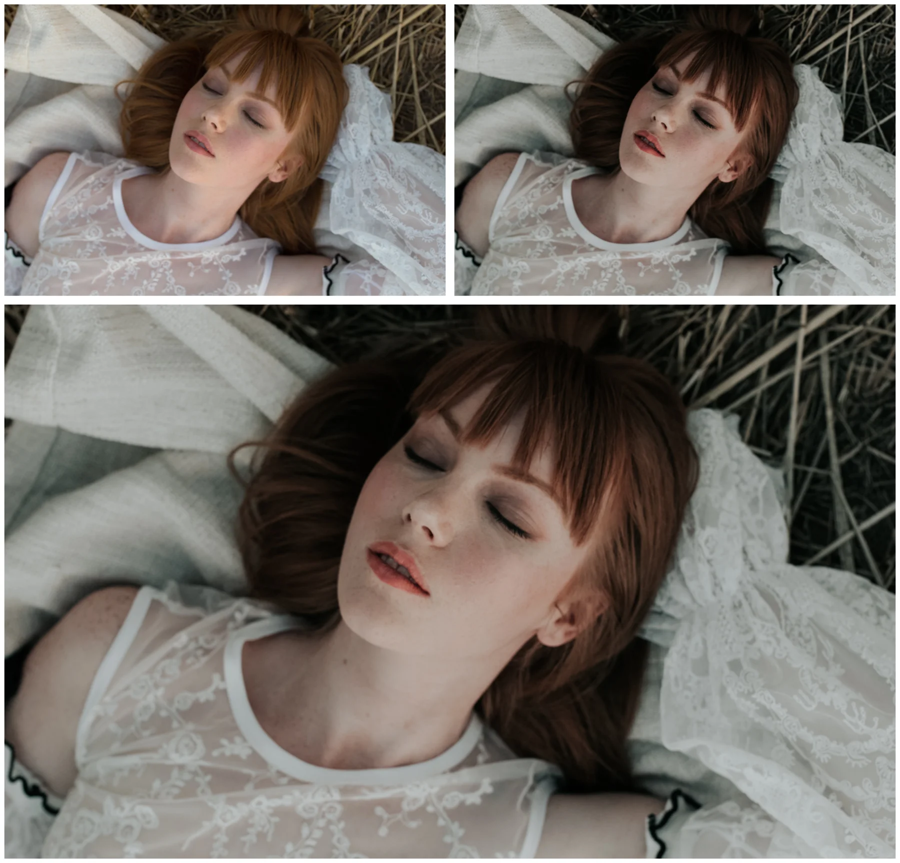
RAW (top left), Dawn Charles DC 03 preset (top right), DC 03 with custom tweaks for skin (bottom)